Final project: Final thoughts
Posted: May 6, 2014 Filed under: Exhibitions and Galleries, Fine Art, Illustration, Stage 3 | Tags: anthropomorphism, character development, children's fiction, conceptual storytelling, drawing, Graphics, illustration, illustrator, interaction, Meaning, Mixed media, picture book, practionner, Text, typeface, Visual Arts, visual storytelling Leave a comment
This is it! Here’s my display for the exhibition installed at last! Less is more…
I had planned to display the other two pieces: the book carved into a box filled with Max and Misty’s Did you know? cards and objects memorabilia as well as the wordless tunnel book. All three books have the same narrative in a different format.This is this aspect that fascinated me and I sought to explore.
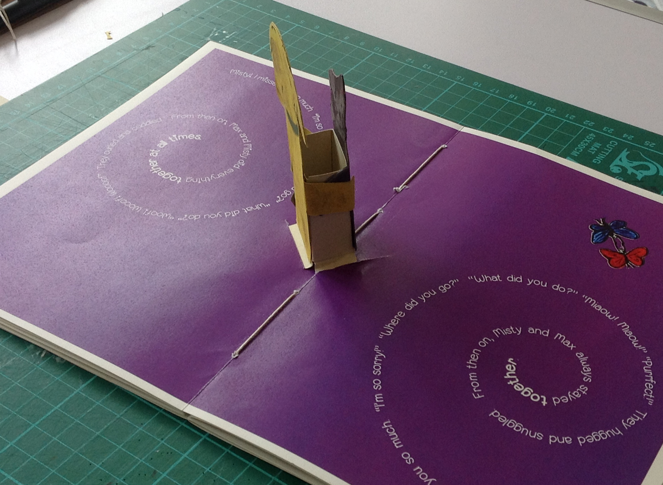
However, after having a conversation with my tutors, we decided that it may be distracting from the main book itself and its innovative format. (You have to flip the book over to read both sides of the story and the resolution is in the middle). Since the book’s ending has a 3D element inside it in the form of a pop up, I didn’t mind too much. Instead, they recommended I showcased the pop up but I chose not to. It is after all the resolution of the book and readers don’t start a book by its ending. So I will let the visitor pick the bookt up (with white cotton gloves please) and discover the surprise inside it.
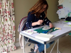
Creating the book has been a roller coaster. I had to wear so many hats: author, illustrator, graphic designer, bookbinder, printer and all that with some non existent skills.
I had to learn: handling watercolour since I usually paint with oils and acrylics – manipulating my artwork in Photoshop: very different from playing with special effects. I especially had to master how to hide blemishes and enhance colour so that it looks good and real and still hand painted. I am very pleased to have retained this element. It was crucial for me.
I had to discover InDesign for the layout of my book from scratch. I have definitely only scratched the surface here.
I had to think about typeface and created my own. And even though it looks amateurish I am particularly pleased with the tile because it is mine and it enhances the meaning of the book.
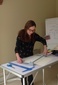
I had to learn how to bind a book and needless to say I am very unskilled with a needle. Preparation (flattening your signatures before hand) and preparation are key. In the end, I had to give up the idea of the hard cover. Having hard a conversation with a book maker expert, the artist in residence, Richard Nash, I agreed that the cover would look thicker than the book itself. It would have looked ridiculous. He suggested a coptc stitching but I failed to deliver. In the end I applied a basic stitching giving it my own twist to make it look pleasing to the eye. I also decided on a book jacket having had to include the cover in one of my signatures to have a multiple of 4. You live and learn, don’t you.
The most interesting aspect was the interplay between text and image. Not so much what you say but what you leave out – not so much what you show but what you leave out. It is wonderful to write and draw, you have the ability to choose the best medium for a scene. At every time, I kept my audience in mind. And although I wanted the story to be accessible I didn’t want to do all the work for them. If not what is the point of reading?
I very much enjoyed all the research about visual storytelling, child development, child psychology, and reading about semiotics. I also tried to cover the cultural aspects by researching the distribution of picture books. Children in the world are not all equal and in underdeveloped countries books are not an accessible commodity. Similarly we get to see work by a few talented artists only. Distribution of picture books is very pricey.
I also touched on the development of publishing and expressed my concern about the trend of epublishing It has a place but it is too soon to assess the impact it has on children’s literature and its audience. I personally feel that at young age, holding a tangible object and sharing a moment with a special person enhances a child’s experience. Opening a book is entering a magic world that will hopefully resonate with you for a very long time.
Finally I wanted to bring to the fore that there is not just one format for books. Books can be sculptural and many artists have demonstrated the truly amazing possibility of paper as a medium. Creating the pop up was extremely challenging and at times I didn’t think I would succeed. I am planning to also explore book arts a lot more from now on.
I wish I had more time..I will revisit my project and very likely take it apart to start all over again! I will take my time and get it right.
Final Project: Happily Ever After
Posted: May 5, 2014 Filed under: Fine Art, Illustration, Stage 3 | Tags: collage, illustration, illustrator, Mixed media, picture book, Visual Arts, visual storytelling Leave a commentThere is more than one way to tell a story. I explored a few possibilities and this is the outcome…

Resolution of main book A5 format

Carved Book Find Max and MIsty’s secrets inside box

Tunnel book 3 layers 2 ponts of view

Fluttering happily ever after
Final project: Picture book and child development theories
Posted: May 5, 2014 Filed under: Fine Art, Illustration, Stage 3 | Tags: Child development, Erik Erikson, Jean Piaget, Lawrence Kohlberg, picture book, Text, Theories in children's literature, Visual Arts, visual storytelling Leave a commentFairy tales sand classics are layered with meanings and symbolism not just make believe and magic tales. Picture books are too but this is not as readily recognised. The stories can in the same way be used to analyse child development from a scientific and philosophical point of view.
The swiss psychologist Jean Piaget developped a model of cognitive theory of development. It has been modified since but it is still widely used today. Basically child development is divided in three stages. In the first one between 0 and 2 years, children are egocentric and can only recognise what they are discovering through all their senses. In terms of literature, board books and novelty books are best tailored to enhance their experience. The second stage between 2 and 7 years of age is what Piaget referred to as the pre operational stage whereby a child only begins to develop logic and a basic understanding of the physical world. Abstract concepts are not understood very well yet but basic concepts such as colours,shapes,sizes, texture…are within reach so much so that it is the best time for picture book to further develop their worldwide knowledge. During the third stage between 7 and 11, children have developed rudimentary logic and can problem solve. They understand abstract thoughts such as time and space. There is where fiction in the form of chapter books and in Europe and USA illustrated storybooks are totally appropriate. I would argue that sophisticated picture books would be ideal to but often they are frowned upon by parents and teachers as going backward. This would be another debate.The final stage is for 11+ onwards where Young adult fiction is great.
Lawrence Kohlberg an American psychologist, also developed a theory on moral development and identified 3 levels with two stages each. the first level from 0 to 7 years is the preconventioal level. Children cannot measure the consequences of their actions the first stage is the assimilation to bad behaviour and punishment and the second is positive reinforcement. The second level occurs between 7 and 11 where the child develops a better idea of the world around him and the values of living in a community. In the first stage, the child wants to conform as he does not want to disappoint. In the second, he conforms not to be disruptive. Int the final level, the post conventional level (11-15 years) a child understands the idea of exchange and morality and in the second stage he can debate and accept the views of others.
ERik Erikson, a German born American developmental psychologist and psychoanalyst identified five stages of psychosocial development. The first one(0-18 months) where the child has unconditional trust for a carer. Books themes are reassurance and unconditional love. The since sate (18months-3years) is when the child starts becoming more independent and explore the world, overcoming self doubt and fear. The children’s market provides a plethora of imaginative stories for this age group. the thirds stage is when a child aged 3 to 6 years develops an understanding of conflict and learn to deal with their emotions. the fourth stage (7-11 years) sees the child learning to cope with failure for the first time as he understands the concept. The final stage is identity and its crisis when the child becomes an adolescent.
Understanding theories can help an author/illustrator shape their stories to meet the need of their audience. Often, it will be spontaneous especially if as in my case you are a parent or have been teaching children.
Reflecting on my work for the final project, this is the way my book could be analysed according to the 3 models highlighted above:
My target audience is 3-6 years.
Piaget: Max and Misty will be accepted as talking animals. A child will believe they sing and cook together. And will be eager to follow their adventure.
ERikson: We are in the second stage. Max and Misty exercise their autonomy and explore the world. We are also in the 3rd stage where they both establish their responsibility and are willing to resolve their conflict.
Kohlberg: were are in the 1st stage level 2 where Max and Misty can reflect on their actions and say sorry to one another.
Picture books’ resolutions ALWASY empowers the protagonist (in my case the two protagonists) which in turn empowers the child himself. I have only scratched the surface of child development and will read more about the implications in children literature in the future. I would also need to analyse how more recent theories take into account the fact that children are bombarded with visual imagery from a younger age and how their development is affected. It must be. In my experience, I find children seem more advanced than ever before. They have the vocabulary and the visual knowledge. But what do they really understand and how do they process the plethora of information. Do we allow children to remain children for as long as we should?
Final Project: What else is out there?
Posted: May 5, 2014 Filed under: Fine Art, Illustration, Stage 3 | Tags: brian wildsmith, eric carle, Jane Chapman, Kazuo Iwamura, paper engineering, picture book, pop up, Visual Arts, visual storytelling 1 CommentI stopped looking at books a little while ago in order not to be influenced by other artists’ styles. Also I had failed to find picture books that told the same story from two points of view…this was until a few friends mentioned some books they had come across. So against my better judgement I decided to have a look. Everything has been done before but it always comes down to how.
The first book tells two different stories during the day and at night. Toddlers are the target audience. The colours are vivid, the illustrations appealing to a young child who will have great fun at discovering the world around him.
The resolutions, is, however, somewhat disappointing. There was no effort to make it easily readable from both sides: You have to flip the book over to read the text.


The second book is Tunnel and Le Tunnel by Brian Wildsmith.
 The tunnel tells the story from Marcus’ point of view and Le Tunnel from Pierre’s in french bien sur! Both moles want to meet up and dig a tunnel under the channel. The book is innovative and packed with paper engineering. The hole gets bigger as they dig. There are wheels you can turn to see what the moles can see until Pierre sees Marcus and vice versa.
Original but the artwork looks busy and cluttered and the layout remains the same throughout . The image at the top with the chunky text sitting below
Wildsmith is a talented artist but this is not my favourite book. I love the concept though.

The last book I came across is probably the most different one. It reads from both sides and also converges in the middle However the english side reads from left to right and the japanese one from right to left. I knew Eric Carle and admire his colourful tissue paper collage and this book does not disappoint.I particularly enjoyed the resolution with the paper unfolding in the middle spread. I initially thought of doing this for Max and Misty but I had the problem that the text would have been upside down and I really didn’t want the hassle of having to twist the book around to read the ending. Here, in where are you going, because english and japanese read differently on the page, the problem is solved. I loved this book.


Three books with the same concept. Three different resolutions. Mine is also different. I introduced paper engineering in the form of a pop up. It hasn’t been plain sailing and at times, I wished I hadn’t thought of that. My pop up is far from perfect but it works. I am proud to have achieved this without prior knowledge. The workshop I attended earlier with Andy Singleton and Richard Sweeney gave me the confidence to attempt something new. I am glad I did. I also made the decision to have swirly text to emulate dynamism and happiness. One has still have to twist the book round but it is fun. (I hope!)
Searching inspiration
Posted: May 4, 2014 Filed under: Fine Art, Illustration, Stage 3 | Tags: Anglia Ruskin MA Children's book illustration, Chris Wromell, epublishing, illustration, illustrator, London Book fair 2014, picture books Leave a commentBeing busy has never prevented me from prioritising what’s really important especially if I can use some inspiration for my own work. Therefore I went to two events that proved to be so worthwhile.
Earlier this year students graduating in MA children’s book illustration at Anglia Ruskin exhibited their final work in London. The postgraduate course must be of an incredible high calibre since the work displayed looked really amazing and professional.
It is always a treat to have a look at artists’ final artwork and sketchbooks. There were as many styles as students. All the displays looked individualistic. I would recommend anybody who is thinking about enrolling to go and have a look for themselves next year.
For the exhibition coming up, I would have liked to display my final artwork but I am told that in Fine Art, this is not the practice. Also each student had a generous space to display more than one piece of work and a large wall to pin work up. Truly inspirational.


I also made time to go to the London book fair. There is no point being an aspiring author/illustrator if you do not research the market you are targeting. I could only attend one day as opposed to three and did a tiny bit of networking.

 Instead I made time to listen to the truly wonderful and talented Chris Wormell. He was hilarious. Sharing his experience and showing pictures of his very very messy studio (it made me feel really tidy in comparison!) he also parted with great advice and encouraged the ones who were serious about illustration to keep persevering as it is getting harder and harder to have a breakthrough.
Chris Wromell
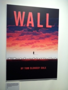
Templar also introduced one of their young talent.Tom Cole whose book Wall will come out in the summer. It is an innovative picture book about the fall of the Berlin Wall. It just goes to show that all themes can make a picture book and it does not have to be ‘just’ a sweet story. There is so much about picture books that people realised. As for the work involved, if you’ve never created one, you cannot imagine just what it takes!

Tom Cole
Finally, I went to a talk on publishing as it is a an exciting development not at all recent any more. The speed at which technology develops to allow apps and other platforms is staggering. Anthony Horrowitz mentioned he would like one of his detective story to be truly interactive and an engineer replied the technology was already there.
I can’t help wondering what it means for children though. From birth, they are bombarded with visual imagery through TV, cinema, tablets….. I truly hope that sharing a story at nighttime and holding a hardback or a paperback is not on its way out. If so, we would all lose out.
Visualising the exhibition space
Posted: May 4, 2014 Filed under: Fine Art, Illustration, Visual Communication Leave a comment

Until now, I had always thought I would display my final outcome, a fully written and illustrated picture book and a poster of some of the final artwork. But as the project evolved, I have been thinking of books as an art form too. I guess being a Fine Art student, it was inevitable that my research would lead me in this direction. Also with my own work, I always think that books should live elsewhere than on the shelves too. I know for most of us, they resonate long after we read them. But for children, who allegedly have a smaller attention span, I think it is essential that they are reminded of their favourite story visually thanks to a painting or a sculpture.
This is how I came to the idea of developing a second book that would be more sculptural with no word. I would pick some elements of the various scenes of the first completed book and let the viewer decide on what the story might be. I elected to create a tunnel book which enabled me to have three scenes starting with my two characters being miserable and alone. the second layer gives clues as to what may have happened and the last one they meet up again. No names, No words. Just buildings and trees rising along the sides and above framing the story.
My third idea was triggered by my love for books and looking at the amazing work done by book artists. I decided to have a box carved into a book full of my two characters secrets. No names. No words. No stories but the premise of one. It is up to the viewer to decide.
In essence, all three books are sculptural. As we speak, I am in the process of making a pop up scene that will bring the story to its resolution. Therefore even the 2D platform has turned into a 3D one. I do not like boundaries and being contained in boxes: painter vs sculptor – fine artists vs illustrators – writers vs storytellers. In this day and age, pluralism has begun to become the norm. The more we think outside the box, the more interesting we become.
I am planning to display the three items on a shelf and have an A1 poster above giving the opening line of my story and two main scenes. I am not sure what space I have been allocated, but I hope that my display will be colourful enough to be inviting and intriguing.
When I come to installing my work, I might change the order of the books or even have more than one shelf to display each item separately. It will very much depend where it sits in the room and what is on either side of my work too. I will find out nearer the time.
Final Project: Book Layout and Typeface
Posted: May 4, 2014 Filed under: Fine Art, Illustration, Visual Communication | Tags: Graphics, picture book, Text, typeface, typography, visual storytelling Leave a commentNow that the story has been written and the final artwork has been completed, I have the task to scan everything and find out whether all the careful planning is coming to fruition. For this I am using inDesign….for the very first time!
The objective will be twofold: to place the artwork in 5 signatures and type the text with the type font I selected as well as making the most use of what inDesign has to offer to make my text curve, climb, skip …just as my characters are doing. From inception I very much wanted to treat the text as illustration in the same manner as Sara Fanelli or Lauren Child. Art and text are there to complement each other in meaning but also aesthetically.
I also intended on the text mirroring the mood and emotions through scale and spacing. If I had kept to Microsoft Word, I would have had to make do with fewer possibilities and this is why despite the tight deadline, I have endeavoured to tackle a new software. Again, I apply the same process as for the whole book where less is more. I was careful not to overdo it so that the meaning does not get lost in the multitudes of effects. For most part, the text remained straight and sat above or below an image. The text curled and swirled only when necessary: a change of pace, a turning point in the story.
I also made the decision to have two fonts: one for each character since both stories are read from each point of view. It is not distracting but it adds another layer and I hope that the font will further illustrate each character’s personality: Max is more bouncy and Misty is calmer. Another crucial decision was to leave the font black. I had thought f colour coding it as Max’s things are blue and Misty’s are red but after careful consideration, I thought it would have been overkill and would have defeated the object. Instead, I colour coded the tile and created Max’ name in bones and Misty’s in fishbones. It took a few attempts to get the right size and the spacing regular. And even when I thought that I had achieved this in the lightbox, I hadn’t completely once I had painted over with blue and red watercolour paint. I therefore had to clean the blemishes in Photoshop. I had a basic knowledge of the latter software but now I have leant a whole new set of tools. For example, the clone stamp has proved particularly useful for importing an image over a background whereas the rubber even the soft rubber left some soft edges. I intend to carry on learning more techniques on Photoshop and inDesign before tackling Illustrator once the course is over.
Overall I am pleased with the result and my learning curve but it is far from perfect. But with more time, it would have become easier and quicker to move from tool to tool proficiently and to gauge effectively what worked or not instead of having to print even spread to check it out. I intend to carry on working on the book to improve it further.
Final Project: Research on Fine Art Storytelling/ Fairy Tales/ My working process
Posted: May 4, 2014 Filed under: Drawing, Fine Art, Illustration, Stage 3, Visual Communication | Tags: Alice in Wonderland, children's fiction, Fairy tales, illustration, illustrator, Little Red Riding Hood, Meaning, Paula Rego, practionner, Synmbolism, Visual Arts, visual storytelling, Zack Zipes Leave a commentPaula Rego
I stumbled upon Paula Rego’s work as I conducted more research in narrative art. I found her work of particular interest because of the way she appropriates the narratives she read in books without being dictated by them. She uses them as a starting point I suppose. She visually rewrites the narratives and turns them into a series of paintings. Looking at her work is similar to reading in between the lines. What is more important is what has been left out rather than told. She accentuates some details and leaves others out. She has no interest in conventional ideas of beauty, or in conventional ideas of art. Art, she says, is ‘disgusting and to be avoided’, by which she probably means do not play it safe and sterile. What interests her is ‘the beautiful grotesque’.

Little Red Riding Hood by Paula Rego
I am particularly interested in the body of works that reference fairy tales. She doesn’t shy away from showing the dark aspects of these tales. For instance, in Little Red Riding Hood, the themes of ambiguity and violence are present just as they are in the tale itself.
Fairy tales
At the end of the tale, Little Red Riding Hood’s innocence dies with her as she is eaten by the wolf. Some theoreticians such as Zack Zipes, an expert on Brothers Grimm, argued that the ending was a sexual act symbolising the chaos of nature. The Brother Grimm tales are still very relevant since we are still attracted to them today. They deal with essential human struggles which are universal and sadly all too common. Most fairy tales are dark because they deal with traumatic incidents that have happened in real life. They can be whimsical despite the dark overtone but they are satisfying because they give the readers a catharsis that helps him overcome whatever it is he s dealing with. I am of course looking at this from an adult’s point of view. A child may not be aware of the undertone especially since there has been many different versions of fairy tales. Some have been turned as a cautionary story warning children to behave and listen to their parents. So in the case of LIttle Red Riding Hood, if she had listened and never left the path, nothing bad would have happened to her.

Little Red Riding Hood directed by Catherine Hardwicke
Contemporary filmmakers and writers, however, reinvent earliest versions of the tale by indulging in the very dark symbolism and the theme of sexual awakening. I am thinking of “Red Riding Hood” written by David Johnson which Catherine Hardwicke directed. Here a werewolf is introduced in medieval times.
Rego’swork illustrates fully the Portuguese proverb :”Whoever tells a story adds a facet.” As a painter, printmaker and collage artist, her style moved away from loose lines to stronger ones. Rego was influenced by surrealism and in particular by the work of Joan Miro. She is in the tradition of automatic drawings whereby the artist disengages the conscious mind from the process of making, allowing the unconscious to direct the image making. But no matter what, her work has always a strong narrative element in place.
My thinking process
Her approach is appealing as I have never adopted this process before. I am more of a planner. I suppose I take a lot of time planning in my head and jolting things down before actually grabbing a paintbrush. I wouldn’t have the confidence of tackling a blank canvas (and I like to paint big) without the initial thought process. I then have the feeling I anticipated as many problems of composition, theme …as possible before new ones arise as I go along. It leaves free to then grow the work organically directly on the canvas.
I think best when I take my dog for a walk. This is when my problem solving happens. Rain or shine, I brave the element because it is the only way I can declutter the mess in my brain. And also it is really healthy so I kill two birds with one stone.
For my characters, I take a very similar approach. I become an actor. I act the scene. I take the pose. For Max and Misty, being animals, it could have been a bit more tricky but it wasn’t since I turned their personalities into tantrum toddlers. I had to worry about accurate anatomy and realistic situations. I couldn’t have had Max in a tree but Misty could. Sometimes, it is like working backwards. Where do I need to get to and how can I get there?
For my paintings, I adopt the same approach. I will think about what I want to say and how I want people to perceive it. Whether they will or not is actually neither here nor there. I sketch my characters directly on the canvas. I refine them in my sketchbook where, like a magpie I gathered all my references. Very often, the composition has been changed over and over so maybe I should adapt a different approach.
Like Rego, I am fascinated by stories and fairy tales. My favourite book of all times is ‘Alice in Wonderland’ by Lewis Carroll.For the painting below, I wanted to have a medley of characters and different scenes from the book and one monochromatic painting. As I went along, I had to leave a lot of characters out and decided to add a splash of red. This led me to think of a series of paintings in different colours and the symbol of each colour…Another project in progress.

Alice in blue

Alice in red
Series on classic stories
Final Project: Research Continued
Posted: May 2, 2014 Filed under: Drawing, Exhibitions and Galleries, Fine Art, Illustration, Stage 3 | Tags: Cats, Dogs, drawings, London Book Fair, Paintings Leave a commentIt is some time a good idea to walk away (literally) from your own work, look at others and interact with fellow artists.
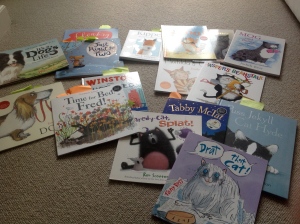
I am passionate about picture books! I am not sure how many I own but it is always a joy to look at the artwork and listen to the words rolling into songs almost. I treasure them. I have a few favourites. Shh.

A cupboard full of some of my picture books
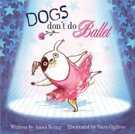
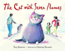
What do cats and dogs look like in picture books?
It seems that illustrators kept a closer likeness before than they do now even though Clifford is a huge red dog…

published in 1963
published in 2010

Published in 1991
Published in 2013
Another point that seems also obvious is that the dogs and cats look rounder when the books are targeted for a younger age group.


How did fine artists painted them? I had never thought about the difference before. Painters have to worry about accuracy and likeness as shown here.


Contemporary artists have moved away from portraits and add another dimension to the animals that are so familiar to us as shown below.
Cat Art Show Los Angeles, a two-weekend, four-day group exhibition beginning Jan. 25, which promises “an examination of the psychology, inspiration and physical impact of cats in our lives.”


Trial and error
Posted: May 2, 2014 Filed under: Drawing, Fine Art, Illustration, Stage 3 Leave a comment
I’m not sure yet


And it goes on and on. When can one say that’s it. I have my character. I can’t help feeling I need to get on with the project at hand even though deep down I am not always satisfied with the outcome and I know that with more time I will get it right, or at least as right as I can make it.
But I have a schedule and I need to move the project along. Next step colouring and poses. Putting them in real situations will also allow to cut word count. My intention is for the images to do most of the talking.

Recent Comments